Police confidence and media coverage: what 25 years of headlines can—and cannot—tell us
In brief
Compare Guardian police headlines with public confidence data, inspect the method and understand why the two trends cannot establish causation.

Public confidence and negative police coverage are not the same measure and they did not follow the same path. In the Crime Survey for England and Wales, the share rating local police as doing a good or excellent job fell from 62% in the year ending March 2015 to 49% in March 2025. This project’s Guardian headline series darkened over a longer period and was already moving negatively while public ratings were still rising.
That is the useful finding. It does not show that press coverage caused confidence to fall. It does not show that the Guardian represents the whole British press. It shows that media language can move differently from survey opinion and should therefore be treated as a separate signal rather than a proxy for trust.
The distinction matters for police leaders. A force can face a hostile information environment while local confidence remains comparatively resilient, or see survey confidence weaken for reasons that are not visible in national headlines. Reading one measure as the other risks diagnosing the wrong problem.
Show the figures
| Year | "Good job" % | Negative headlines % |
|---|---|---|
| 2000 | — | 0.0 |
| 2001 | — | 3.2 |
| 2002 | — | 5.0 |
| 2003 | — | 4.5 |
| 2004 | 47.4 | 2.6 |
| 2005 | 48.5 | 8.5 |
| 2006 | 50.4 | 6.1 |
| 2007 | 51.1 | 6.6 |
| 2008 | 52.6 | 8.2 |
| 2009 | 53.3 | 8.0 |
| 2010 | 56.4 | 9.2 |
| 2011 | 58.8 | 8.6 |
| 2012 | 62.4 | 14.9 |
| 2013 | 61.5 | 14.8 |
| 2014 | 62.8 | 16.4 |
| 2015 | 62.0 | 17.4 |
| 2016 | 62.9 | 16.2 |
| 2017 | 62.2 | 14.9 |
| 2018 | 61.7 | 15.1 |
| 2019 | 57.5 | 18.0 |
| 2020 | 55.4 | 20.0 |
| 2021 | — | 24.4 |
| 2022 | — | 23.6 |
| 2023 | 51.2 | 19.3 |
| 2024 | 48.8 | 18.8 |
| 2025 | 48.8 | 18.4 |
ONS confidence: Crime Survey for England & Wales, "the police in this area do a good or excellent job", by year ending March (ONS, Aug 2025). No figure for the years ending March 2021–22 (survey suspended for COVID-19); 2004–05 predate the local-confidence question. Headline figures are derived from this project's own headline analysis.
The confidence series is clear about the recent decline
The Office for National Statistics asks Crime Survey for England and Wales respondents: “Taking everything into account, how good a job do you think the police in this area are doing?”
In the year ending March 2025, 49% gave a good or excellent rating. A decade earlier, in the year ending March 2015, the figure was 62%. ONS describes a general downward trend over the last nine years. The face-to-face survey was suspended during the COVID-19 pandemic, so comparable figures are not available for the years ending March 2021 and March 2022.
This is one measure of perception, not a complete definition of confidence. The same ONS release reports other measures, including confidence in the local police and satisfaction among victims who reported crime. Those series answer different questions. This article uses the good-or-excellent measure because it provides a long, interpretable comparison with the headline dataset. It is also the outcome the Neighbourhood Policing Guarantee is, in part, designed to move.
The wider policy point is developed elsewhere in the site’s neighbourhood-policing confidence analysis: public confidence is an outcome with several plausible drivers, including contact quality, visibility, crime and disorder, fairness, institutional reputation and expectations. A headline series can illuminate part of that environment. It cannot replace the survey.
The headline series is a record of language, not public opinion
The second line in the chart comes from this project’s own analysis. It uses the Guardian Open Platform Content API to retrieve police-related headline records across the available period and then examines vocabulary, themes and a simple positive/negative word classification.
That source needs to be named plainly because it changes the claim. The original version of this article was titled as though the analysis covered the British press. It does not. The deep historical dataset is overwhelmingly Guardian material. The correct description is therefore a long-run analysis of Guardian police headlines, with the architecture built so additional sources can be added later.
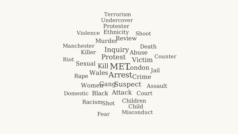
Every word this year — scroll for more
- met86.9
- arrest58
- palestine42.8
- protest40
- inquiry38.6
- family37.3
- suspect35.9
- action35.9
- happen33.1
- england30.4
- kill29
- victim29
- london26.2
- wale26.2
- attack24.8
- gang24.8
- crime23.5
- abuse22.1
- murder20.7
- maccabi20.7
- facial20.7
- review20.7
- find19.3
- recognition19.3
- black19.3
- sexual17.9
- southport17.9
- women17.9
- killer16.6
- case16.6
- ethnicity16.6
- right16.6
- death15.2
- court15.2
- sex15.2
- investigation15.2
- jail15.2
- pro15.2
- children15.2
- claim15.2
The share of negative words (riot, murder, corruption…) and positive words (trust, praised, award…) in UK police headlines each year, based on Guardian coverage.
Headlines analysed
2471
Negative words
18%
Method: hybrid. Tone and counts are derived aggregates over the sampled headlines; no article text is stored.
The explorer is useful because it allows the reader to inspect the descriptive pattern rather than accept a single summary statistic. In the project series, negative headline language increases across much of the period and reaches its highest levels in the early 2020s. Public ratings, by contrast, improved for part of the 2000s and early 2010s before turning down.
That divergence is more informative than a correlation coefficient would be. If headline tone simply mirrored public opinion, the two series should broadly rise and fall together. They do not. Their later movement in the same direction is therefore not enough to infer that one drove the other.
What changed in the vocabulary
Tone compresses language into one number. The theme analysis shows what was changing inside it.
The project records an increasing prominence of words connected with misconduct, vetting, racism, misogyny, failure and institutional reform in the later years. Those shifts sit alongside major events and official findings that altered the national policing story.
The historical starting point predates most of the dataset. The Stephen Lawrence Inquiry, published in February 1999, made institutional racism a central term in debate about the Metropolitan Police and British policing more broadly. More than two decades later, Baroness Louise Casey’s 2023 review of the Met returned institutional culture, standards and public trust to the centre of national coverage.
Between those institutional reviews were events with substantial independent news value: the murder of Sarah Everard by a serving Metropolitan Police officer, revelations about misconduct at Charing Cross police station, the strip-search of Child Q and the offending of David Carrick. A change in headline language around such events is not evidence of media distortion by itself. Some periods contained genuinely serious policing failures and official findings that warranted sustained scrutiny.
Theme rates by year (table)
| Year | Trust | Misconduct | Race | Terrorism | Protest | Reform |
|---|---|---|---|---|---|---|
| 2000 | 89.3 | 0 | 178.6 | 0 | 89.3 | 89.3 |
| 2001 | 0 | 0 | 47.8 | 47.8 | 0 | 79.6 |
| 2002 | 0 | 40.9 | 61.4 | 0 | 51.2 | 61.4 |
| 2003 | 5.4 | 18.8 | 51 | 18.8 | 10.7 | 53.7 |
| 2004 | 0 | 20.3 | 0 | 0 | 20.3 | 101.6 |
| 2005 | 0 | 18.6 | 18.6 | 55.9 | 18.6 | 204.8 |
| 2006 | 12.8 | 25.5 | 38.3 | 63.8 | 0 | 153.1 |
| 2007 | 8 | 16.1 | 32.2 | 56.3 | 24.1 | 136.7 |
| 2008 | 8.4 | 21 | 88.3 | 23.1 | 25.2 | 119.9 |
| 2009 | 10.6 | 50.6 | 42.4 | 55.3 | 90.6 | 90.6 |
| 2010 | 10.5 | 45.8 | 56.3 | 36.7 | 76 | 127 |
| 2011 | 7.5 | 40 | 19 | 16.3 | 88.1 | 115.2 |
| 2012 | 11.6 | 74.7 | 53.2 | 13.1 | 31.6 | 131.7 |
| 2013 | 13.7 | 66.6 | 37 | 13.7 | 28.5 | 122.6 |
| 2014 | 13.8 | 78 | 37.8 | 26.4 | 31.5 | 107 |
| 2015 | 6.1 | 96.1 | 37.7 | 60.8 | 19.5 | 158.2 |
| 2016 | 8.1 | 97.3 | 41.9 | 43.2 | 13.5 | 148.6 |
| 2017 | 14.7 | 52.6 | 39.1 | 73.3 | 13.4 | 146.7 |
| 2018 | 5.1 | 75.5 | 51.2 | 37.1 | 5.1 | 104.9 |
| 2019 | 9.1 | 106.4 | 59.7 | 20.8 | 49.3 | 98.6 |
| 2020 | 10 | 72.8 | 141.8 | 26.4 | 59 | 76.6 |
| 2021 | 19.6 | 111.3 | 78.6 | 15.3 | 76.4 | 102.6 |
| 2022 | 14.1 | 70.3 | 93 | 7.6 | 44.3 | 104.9 |
| 2023 | 10.9 | 75.6 | 61.9 | 20 | 41.9 | 89.3 |
| 2024 | 9.3 | 54.9 | 50.2 | 15.2 | 46.7 | 95.7 |
| 2025 | 11 | 80 | 67.6 | 20.7 | 56.6 | 85.6 |
That point is essential to the interpretation. A rising negative-language series can result from editorial choices, changes in what events occur, changes in institutional transparency, changes in public concern, or all of them. The dataset describes the published language. It does not identify which process produced it.
The method is deliberately inspectable
The analysis makes several choices that materially affect the output.
First, it uses headlines rather than full article text for the language analysis. That makes the dataset a measure of framing at the point a story is presented to a reader, not a complete analysis of what the article says.
Second, yearly word and headline volumes vary. Counts are therefore normalised rather than compared as raw totals, so a year with more archived material does not automatically appear to contain more of every theme.
Third, the tone classifier is deliberately simple. It counts a defined dictionary of positive and negative terms. That makes the method reproducible and easy to inspect, but it cannot reliably understand irony, negation, quotation, context or whether a negative word refers to the police, a suspect or the situation being reported. The resulting percentage should not be treated as a validated national measure of ‘negative media’.
Fourth, source diversity is weak. The pipeline records provenance and a diversity measure, but the historical material is so heavily Guardian-based that the responsible interpretation is single-source analysis. That is a limitation, not a footnote.
This follows the same principle as the site’s guide to reading policing statistics: a number becomes more useful when the reader knows how it was produced and what alternative measurement choices would change it.
The two series cannot establish causation
The tempting claim is that increasingly negative coverage caused public confidence to fall. This dataset cannot test that.
There are at least three competing explanations. Media coverage could affect perceptions. Public concern could affect which policing stories receive attention and how they are framed. Or both series could respond to the same underlying events, such as visible misconduct, crime trends, political disputes, leadership crises or changes in police-public contact.
The timing does not resolve those possibilities. The fact that headline negativity rose while confidence was still improving in the earlier period is evidence against a simple one-to-one relationship. The fact that both later move in an unfavourable direction does not reveal which mechanism dominates.
There is also a selection problem. The Guardian’s editorial agenda, audience and archive are not the British population. Adding the Daily Mail, Telegraph, Times, BBC, regional news and broadcast transcripts could produce a different aggregate vocabulary. Until that work is done, the article should not make a claim about ‘the press’ that the source base cannot sustain.
The social-media question is even further removed. Algorithmic feeds changed how people encountered news during this period, but this dataset contains no social-media posts, recommendation data or engagement measures. Any feed milestones shown in the explorer are context, not explanatory variables.
What the analysis is good for
The dataset has value precisely because it is not another confidence poll.
For a police leader, survey confidence answers one question: how respondents rate policing. Headline analysis answers another: what language a major publication repeatedly used when presenting policing to readers. Complaints data, victim satisfaction, local engagement, crime experience and social-media discussion answer others again.
Keeping those measures separate allows a more useful diagnosis.
If confidence falls while local experience measures remain stable, institutional reputation or wider information may deserve closer examination. If media tone improves while victim satisfaction deteriorates, a communications success should not be mistaken for an operational one. If both worsen after a major misconduct event, leaders still need evidence before claiming one caused the other.
This also changes how forces should think about communications. The aim cannot sensibly be ‘make the headlines positive’. Police press offices do not control the news agenda, and difficult reporting can be justified. A stronger objective is to make important factual information accessible, correct false claims quickly, publish performance and investigation information where lawful, and test whether those actions improve understanding among the audiences that matter.
The next version should test whether the finding survives outside the Guardian
The strongest next step is methodological rather than rhetorical.
The project should extend the same reproducible pipeline to additional UK national and regional sources where lawful, technically reliable archive access exists. The question is whether the early divergence and later concentration of misconduct language survives when different editorial positions and audiences are included.
Before adding complexity, the existing series should remain clearly labelled as Guardian-derived. Each chart should retain source coverage, yearly volume and methodological notes. Any automated sentiment measure should be treated as descriptive unless validated against a manually coded sample.
For forces, the equivalent recommendation is to build an information-environment dashboard only if its measures remain distinct. Survey confidence, victim satisfaction, complaints, local news tone and digital discussion should not be collapsed into one synthetic ‘trust score’. Leaders need to know which signal is moving and why.
The ONS series tells us that public ratings of local police are materially lower than a decade ago. This project tells us that one major newspaper’s police language changed on a different timetable. The gap between those findings is not an inconvenience to be explained away. It is the reason to measure both.
Method note: headline figures and trends are project-derived aggregates over Guardian Open Platform police-related records, normalised for differences in yearly volume. The language analysis uses headlines and headline-level provenance rather than full article text. The tone measure is a dictionary classifier intended for relative comparison, not an authoritative sentiment score. Confidence figures are from the ONS Crime Survey for England and Wales, using the question about whether local police do a good or excellent job. Comparable CSEW figures are unavailable for the years ending March 2021 and March 2022 because of the pandemic suspension of face-to-face interviewing.
Discussion questions
- 01
What should police leaders monitor alongside public-confidence surveys if they want to understand the information environment around policing?
- 02
Which claims about media effects would require evidence this headline dataset cannot provide?
- 03
Would a genuinely multi-outlet dataset change the interpretation, and which publications or platforms should be added first?